dishnetwork website just updated

TBarclay said:
What's wrong with "suck?" Isn't that what a vacuum cleaner does?

Yes, sorry, there was no "sarcastic smiley". I should have pointed that out in my post. I still think its kinda lame for them to use suckfreetv.
 
I just looked, and I swear this is a hack job. no way dish did this, the transparent images are blurry, the design is horrible (refreshing did make it change, even though it was the first time I went in a few days). There's just no way that Dish would be using the word "suck" so much, we all know who will get offended by this, the very people they covet for charlie chat guests...

It doesn't make any sense at all...Please, Nobody try to login on that site for a few days...
 
I just looked, and I swear this is a hack job. no way dish did this, the transparent images are blurry, the design is horrible
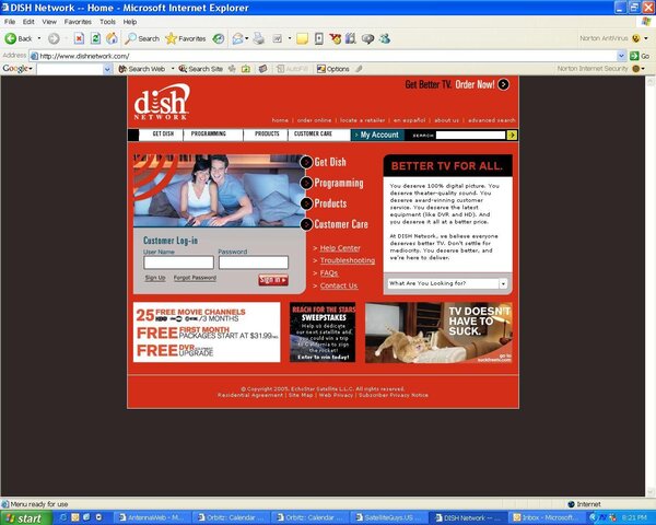
Yes it is Dish Networks real page. I got an email from them this morning when I mentioned the site looked terrible telling me to try refreshing.

The SuckfreeTV I actually find offensive. Taking emotional natural disasters and trying to sell satellite service off of them is not only offensive but stupid as well. Even they flash where you click on things and watch them get sucked into the TV are stupid.

I can't believe Dish Network paid someone to do both of those sites.
 
Purogamer said:
I just looked, and I swear this is a hack job. no way dish did this, the transparent images are blurry, the design is horrible (refreshing did make it change, even though it was the first time I went in a few days). There's just no way that Dish would be using the word "suck" so much, we all know who will get offended by this, the very people they covet for charlie chat guests...

It doesn't make any sense at all...Please, Nobody try to login on that site for a few days...

Well, I just logged in and it retrieved my account information so this is the real Dishnetwork site. :shocked
It's a horrible web site design, a Web Design 101 student could've done better than that. The images are blurry and the red background has to go.
 
Holy sweet jumping cripes on a popsicle stick!!!! That is one godawful looking website. It still looks like it's in alpha stage. Truly an embarrasment.

The nav buttons, links, graphics, placement, colors, text, all look grossly amateurish. Some button effects don't even work properly.

The logo is indeed poorly rendered. It appears that they used a very small and/or low resolution image, and resized it too large.

The word "suck" is certainly not offensive, unless one is caught up in this weird 17th century puritan fad spreading like cancer in this formerly progressive nation. But, it is indeed a somewhat childish, and certainly unprofessional word and campaign for a company the size and status of Echostar / Dish Network.

The person(s) responsible for approving this debacle should be thrown under the corporate bus. And, the vendor/contractor/employee responsible for the actual design should be replaced, if they can't come up with a design worthy of a company like Dish.

In the mean time, they need to revert to the old design until the new one is actually ready.
 
GaryPen said:
The word "suck" is certainly not offensive, unless one is caught up in this weird 17th century puritan fad spreading like cancer in this formerly progressive nation. But, it is indeed a somewhat childish, and certainly unprofessional word and campaign for a company the size and status of Echostar / Dish Network.

Oh good Lord, I'm going to say it. . .

I agree with Gary <sigh>
 
The logo on the front page is just stretched by the IMG tag. View that image separately and you'll see (in mozilla, right-click and select "View Image").

I don't like the overall layout of their pages, the random placement of stuff that leaves far too much illogical open space. Also, the tiled grey "space beams" background behind the blue collections of links looks horrible.
 
It's bad. If thats the best they can do go back to the old one! This makes me wonder what the new interactive TV screen is going to look like?
 
You think its bad, take a look at the print ads coming out (2 are attached in PDF format) I feel sorry for the poor cat in one of the ads. I wonder if they had the humain society there when they shot that ad. :D

BTW here is a portion of a note which was sent out to retailers today about the changes.

Dear DISH Network Retailer,

Today we begin an exciting new chapter of DISH Network with the launch of “Better TV for all.” You will see this rallying cry as we start new TV and print ads, plus a new entertaining micro-website. We want you to know what is launching today, and the support available to help you get involved in this aggressive and fun campaign. Be sure to watch the August 18th Retailer Chat for full details.

BETTER TV FOR ALL.
As DISH Network continues to compete, and Pay-TV services are seen as more of a commodity, we need to look at what will separate us from the competition – we need to create a sustainable competitive advantage. We need to clearly define who we are in the marketplace. To that end today we are unveiling the DISH Network brand relaunch under the banner “Better TV for all.”

“Better TV for all” is our new positioning statement. We want to emphasize to the consumer that we are the champions of better TV and we are dedicated to the relentless pursuit of making TV accessible and affordable for everyone; Better TV at a Better Value with top-rated customer service.

Our aggressive new campaign and positioning statement of “Better TV for all” will remind people of how unhappy they are with their current Pay-TV service and that when it comes to their TV entertainment, they DO have a choice. “Better TV for all” means that consumers can count on DISH Network to provide TV at a:

· Better Price
· With Better Service
· And far Better Technology


MARKETING MATERIALS
To get our new message out, we need to break through the clutter in the marketplace. We want to create buzz and snap cable customers out of their inertia so they understand DISH Network really is better and that it’s worth their effort to make a change. Starting today we are launching our new and fun advertising campaign, “Does Your TV Suck?” The campaign is a light-hearted effort to get cable customers to consider why they are still staying with TV that literally sucks.

We kicked off the effort with new TV ads and a new entertaining website – www.suckfreetv.com. Suckfreetv.com pokes fun at TV that sucks and helps create awareness about DISH Network. On the site you can view our new TV ads and play an interactive game. The benefit of this site is to broaden the reach of our new campaign via the Internet. This “viral advertising” also includes e-mails to existing customers and employees. Please take the time to visit this site and also encourage employees, customers, friends and family to check it out.

Here are two of the new ads in PDF format.
 

Attachments

  • Does_Your_TV_Suck-Kitty_4c.pdf
    1.6 MB · Views: 315
  • Does_Your_TV_Suck-Man_4c.pdf
    1.5 MB · Views: 112
Scott said:
... This “viral advertising” ...
I couldn't have described it better myself... :D

The images in both those PDFs have left me emotionally scarred. I twitch now.

On a related note, did anyone notice that the Weather Channel also changed their logo yesterday morning? I wonder if their water coolers are supplied by the same distributer Dish Network uses...
 
Scott Greczkowski said:
You think its bad, take a look at the print ads coming out (2 are attached in PDF format) I feel sorry for the poor cat in one of the ads. I wonder if they had the humain society there when they shot that ad. :D
It looks PhotoShopped. It also looks stupid.

I understand the double-meaning of the word suck. On the one hand, to say cable TV sucks is to say it's bad. That meaning is clear.

OTOH, the pictures are showing the TV sucking you (and your pets) in. Isn't it good if it sucks you in? In that usage, it means that it is compelling. (Hey. It's been obvious for years that Charlie doesn't understand the meaning of compelling, either.)

The ad campaign is almost as bad as the new website itself. (It looks cheaply done, as well.)
 
Scott Greczkowski said:
You think its bad, take a look at the print ads coming out (2 are attached in PDF format) I feel sorry for the poor cat in one of the ads. I wonder if they had the humain society there when they shot that ad.

OMFG... whoever came up with this lame-ass advertising campaign deserves to be @#$#@%#$%!!!
 
I rather like their new orange/grey color theme and new website. It is different and unorthodox from the red they have always used, but it looks alright. The new logo is rendering great and looks alright (not much different). The main content of all the pages have stayed the same, but their new design, I think, makes it more manageable and navigable. I logged in and the customer service content looks the same except for the new style sheet. It worked just like it always has (which I don't think is very well, in that it isn't very capable). The local channel qualification script has not been updated. In general, the new website looks spiffy, although the content has not changed (it needs to).

All the SuckFreeTV stuff really sucks.
 
kavula said:
I rather like their new orange/grey color theme and new website. It is different and unorthodox from the red they have always used, but it looks alright. The new logo is rendering great and looks alright (not much different). The main content of all the pages have stayed the same, but their new design, I think, makes it more manageable and navigable.
Jeez. Talk about a Dish apologist. Denial ain't just a river in Egypt. It's the Emperor's New Website.

WTH browser are you using? It looks like crap with both IE and Netscape.

Logo is improperly rendered.
Menu buttons not working correctly.
Most elements not lined up correctly.
Horrible looking grey nav box in upper left on child pages.
Graphics randomly placed on all the pages.

It looks like it is a student sample from a basic web design class...a special ed basic web design class.
 
Thanks for reminding me. I'm using IE6.0 on a WinXP Pro SP2 computer.

All of the elements as far as I can tell are loading and working just fine. I'm attaching a screenshot so all of you who are having troubles can see what you are/are not seeing correctly. I also accessed the new site without troubles this morning. Edit: I looked at the screenshot I just put up and noticed some off-color blobs and other minor problems. They are problems with the JPEG compression of the screenshot, the actual Dish website looks better.
 

Attachments

  • dishsite.JPG
    dishsite.JPG
    145.6 KB · Views: 104

Users Who Are Viewing This Thread (Total: 0, Members: 0, Guests: 0)

Who Read This Thread (Total Members: 1)