
Old ui looked cleaner to me
- Thread starter HoppertheKangaroo18
- Start date
- Latest activity Latest activity:
- Replies 155
- Views 5K
You are using an out of date browser. It may not display this or other websites correctly.
You should upgrade or use an alternative browser.
You should upgrade or use an alternative browser.
Here's the thread so everyone can reply history of dish on itI loved the old 922 and hopper ui. I'm not sure why they changed it. Maybe it was Charlie's idea View attachment 182690

Personally I like the latest carbon UI, it looks clean and modern. How about this classic?


That is just BEUTIFUL! I always wanted a reciever with that ui! I think bell still uses thatPersonally I like the latest carbon UI, it looks clean and modern. How about this classic?
View attachment 182691
That is just BEUTIFUL! I always wanted a reciever with that ui! I think bell still uses that
Even on the Charlie Chats they made fun of the padlock shown in the guide

I wish dish brought back the old uiEven on the Charlie Chats they made fun of the padlock shown in the guide
I wish dish brought back the old ui
A "classic" option in the preferences menu would be pretty cool.
That would be geniusA "classic" option in the preferences menu would be pretty cool.
I like the UI from old VIP solo boxes, The whole UI change on that start with the first hopper is horrible in my eyes, everything huge thumbnails wasted space like most modern ui that look like the belong on mobile devices.
I miss the old DVR page where it it LISTED the names of show instead of current 5 huge thumbnails per row listing... such wasted space, I dont even use "thumbnails" listing on windows file explorer for anything but the picture folder, that and it something that trigger my ocd is gona be something I never gona like, and huge in your face thumbnails and tons of wasted space is one them
I miss the old DVR page where it it LISTED the names of show instead of current 5 huge thumbnails per row listing... such wasted space, I dont even use "thumbnails" listing on windows file explorer for anything but the picture folder, that and it something that trigger my ocd is gona be something I never gona like, and huge in your face thumbnails and tons of wasted space is one them
Don't the 922 and original hoppers share the same ui?I like the UI from old VIP solo boxes, The whole UI change on that start with the first hopper is horrible in my eyes, everything huge thumbnails wasted space like most modern ui that look like the belong on mobile devices.
I miss the old DVR page where it it LISTED the names of show instead of current 5 huge thumbnails per row listing... such wasted space, I dont even use "thumbnails" listing on windows file explorer for anything but the picture folder, that and it something that trigger my ocd is gona be something I never gona like, and huge in your face thumbnails and tons of wasted space is one them
I totally agree with you. I like every ui but I do have favoritesI came to prefer the new UI.
There was the Hopper GUI as shown at CES 2015:


Scott reporting directly from CES 2015!
")
First Pic shown: my personal favoriteThere was the Hopper GUI as shown at CES 2015:
Thought someone would like thisScott reporting directly from CES 2015!
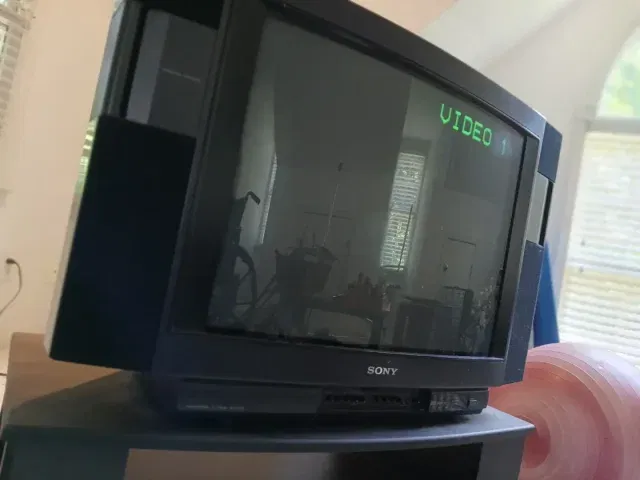
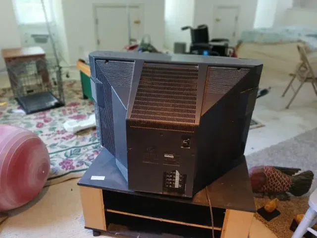
Thought somebody would find this cool. I FINALLY opened up and cleaned the dust out of our trinitron earlier!. It works like new and has no problems now. I guess all you need is a paintbrush and a vacuum cleaner for cleaning it out.Scott reporting directly from CES 2015!
Attachments
Thought someone would like this
Thought somebody would find this cool. I FINALLY opened up and cleaned the dust out of our trinitron earlier!. It works like new and has no problems now. I guess all you need is a paintbrush and a vacuum cleaner for cleaning it out.
15 years ago you couldn't give a CRT away, now they're collectable!
I know right?!15 years ago you couldn't give a CRT away, now they're collectable!
Users Who Are Viewing This Thread (Total: 0, Members: 0, Guests: 0)
Who Read This Thread (Total Members: 164) Show all
- HoppertheKangaroo18
- tcpuccio1
- JeffN9
- johnissoevil
- renegade734
- ElectronicSearch
- Bobby
- Mr Tony
- bhawley
- Cold Irons
- Jim S.
- Jim5506
- tallfence
- RobMeyer1
- ewindowman
- Former member 53486
- Foxbat
- dsimmon9
- cpdretired
- pamajestic
- msbehavin
- JimC
- Dell00iss
- brice52
- harshness
- dhunter113
- bwest602
- njack11
- b4pjoe
- llokey
- Willh699
- worstman1
- sklunk
- JSheridan
- RTCDude
- bobc469
- MrMars
- navychop
- AkaDoubleG
- zippyfrog
- lordodogg
- yelraek
- dishdude
- n0qcu
- charlesrshell
- MikeD-C05
- HIFI
- Pepper
- MikeRelaxer
- Nominal
- skinnyJM
- klang
- winter60
- larryk
- Scott Greczkowski
- riderj
- tjboston5676
- dennispap
- johnr475
- jsmit86
- Bichon