There isn't room in the grid - look at the tiny space at the very right. The >>12 hours isn't in the way of expanding the guide, unless they redesigned it. Get rid of the logos and move the channel name/number to the very left and maybe you could squeeze another half hour but I think it would be crowded. This new UI isn't so much new as a reworking of the same software.What if they moved the +12 hours to before the -ALLSUB Press 0 To Change or after the Press - To Search?

New Genie UI now in CE testing
- Thread starter rad
- Start date
- Latest activity Latest activity:
- Replies 642
- Views 73K
You are using an out of date browser. It may not display this or other websites correctly.
You should upgrade or use an alternative browser.
You should upgrade or use an alternative browser.
- Status
- Please reply by conversation.
What about the Hopper 3 guide? They have the channel names, numbers, logos and half two and half hours on their guide. Also their font doesn't look too small.There isn't room in the grid - look at the tiny space at the very right. The >>12 hours isn't in the way of expanding the guide, unless they redesigned it. Get rid of the logos and move the channel name/number to the very left and maybe you could squeeze another half hour but I think it would be crowded. This new UI isn't so much new as a reworking of the same software.
My take from looks of it - it's more of a Cross between AT &T Universe and D* -meaning they may be trying to go across all plat forms at some point - Just my OP
What about the Hopper 3 guide? They have the channel names, numbers, logos and half two and half hours on their guide. Also their font doesn't look too small.
Oh I am not saying it can't be done. But it would take a major reworking and the new interface is not that.
I think I get it now. Maybe this really isn't an all new interface but just a reworking like you said. Then I guess this will be the all new interface that they are working on?Oh I am not saying it can't be done. But it would take a major reworking and the new interface is not that.
DIRECTV NOW Cloud DVR Will Come Courtesy of New Unified AT&T Entertainment Platform - Telecompetitor
PLEASE LOG IN TO GET RID OF THESE ADS!
Last edited:
Haven't done a CE in years but downloaded it to the 54 last night just for s&g.
Haven't had time to play with it yet this AM.
Definitely going to take some getting used to.
Haven't had time to play with it yet this AM.
Definitely going to take some getting used to.
Right.If they did away with the Logos !
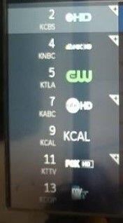
No offense, but why the need for channel logos when the name of the channel is displayed under the channel number? They could get rid of the logos and move things to the left and give us another hour of guide data, no? Or place the logo under the channel number?
Also, I see no love for PIP. The should move PIP to the left of INFO on the banner, or better yet, give us a damn one button PIP on/off toggle already!
")
Logo's, because people want logo's, don't you see all the post from people that say their logo's are missing. I agree, just give me text, can put more info on the screen and make it run quicker.Right.
No offense, but why the need for channel logos when the name of the channel is displayed under the channel number? They could get rid of the logos and move things to the left and give us another hour of guide data, no? Or place the logo under the channel number?
Also, I see no love for PIP. The should move PIP to the left of INFO on the banner, or better yet, give us a damn one button PIP on/off toggle already!
PIP, since the direction is the HS17 and clients I don't see much happening with PIP.

Oh I know. Sure wish we had Sports Bar mode like Dish.PIP, since the direction is the HS17 and clients I don't see much happening with PIP.
... Or place the logo under the channel number? ...
Not enough room to place them underneath ...
Grid blocks are too narrow vertically. Unlike DISH and others, DIRECTV's only has room for a single line of characters.
Same with TIVO's grid guide
PLEASE LOG IN TO GET RID OF THESE ADS!
Beyond glitz and eye candy ... Nothing really ...I don't want to make anyone mad, but could someone please explain to me what advantage logos provide?
But I guess that's the nature of home entertainment ...
What's pragmatic and what's attractive to the consumer are not always synonymous.
 ?
?To me it makes no difference. I guess some like the visual impact of having logos.I don't want to make anyone mad, but could someone please explain to me what advantage logos provide?
I didn't care for logos on the guide until I left them turned on with my TiVo. Now I prefer it as I can scan the channel list quickly and not have to remember the channel numbers.
PLEASE LOG IN TO GET RID OF THESE ADS!
Would not having the logos make the guide look like its out of date? If not then maybe not having the logos vs. having an extra half hour would be better? Would it seem weird not having the logos in the guide but having a lot more box art everywhere? Here is the UVerse guide with an extra half hour and no channel logos.
https://cng.i.lithium.com/t5/image/...F4FB3F9FE5/image-size/original?v=mpbl-1&px=-1
https://cng.i.lithium.com/t5/image/...F4FB3F9FE5/image-size/original?v=mpbl-1&px=-1
Would not having the logos make the guide look like its out of date? If not then maybe not having the logos vs. having an extra half hour would be better? Would it seem weird not having the logos in the guide but having a lot more box art everywhere? Here is the UVerse guide with an extra half hour and no channel logos.
https://cng.i.lithium.com/t5/image/...F4FB3F9FE5/image-size/original?v=mpbl-1&px=-1
That guide is awful. A 90 minute guide that you can see if better than that mess.
Earlier in this thread I suggested just keeping the current guide, going all HD and adding that new Internet connection set-up wizard that Scott talked about. Would just doing those things that be good? Except sometimes the info button sticks using the guide on my HR-44. Or does the current guide look outdated?That guide is awful. A 90 minute guide that you can see if better than that mess.
I seriously don't want to see them go all LOGO with no name.Right.
No offense, but why the need for channel logos when the name of the channel is displayed under the channel number? They could get rid of the logos and move things to the left and give us another hour of guide data, no? Or place the logo under the channel number?
Also, I see no love for PIP. The should move PIP to the left of INFO on the banner, or better yet, give us a damn one button PIP on/off toggle already!
- Status
- Please reply by conversation.
Similar threads
- Replies
- 1
- Views
- 175
- Replies
- 85
- Views
- 13K
- Replies
- 81
- Views
- 6K
- Replies
- 48
- Views
- 2K
