iOS 7 concept shows that change is good
- Thread starter Poke
- Start date
- Latest activity Latest activity:
- Replies 10
- Views 2K
You are using an out of date browser. It may not display this or other websites correctly.
You should upgrade or use an alternative browser.
You should upgrade or use an alternative browser.
There is a reason why Windows 8 is a big flop. Why make iOS look like Windows 8?
Sent from my Jailbroken iPhone 5 using SatelliteGuys
Sent from my Jailbroken iPhone 5 using SatelliteGuys
I thought that Skewmorphism was dead. What's with the folded paper map for the new Apple Maps app? That's a step backward IMHO.
Also, I don't understand this headlong rush to the duo-tone (flat) iconography. IMHO (again) this is undoing the last 20 years of computer engineering that has gone in to GPU designs. If Microsoft can't come up with a smartphone GUI that doesn't eat up battery life and had to simplify icons so they could slide them around responsibly and called it "Metro". Now, everybody thinks these naive icons are the SOTA. Meh. They look cheap and unrefined.
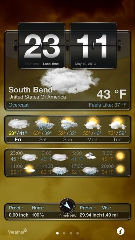
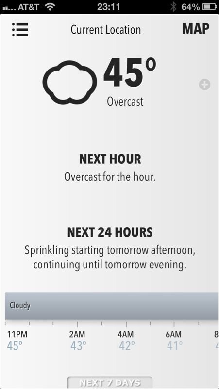
There are two weather apps (well, Weather+ is an app, Forecast.io is an HTML5 webapp) that demonstrate this difference in philosophy. Weather+ is animated, changing the background in response to the current conditions, Forecast always looks the same except for the one animated icon of current conditions. One is photorealistic and the other is flat and simple.
It would be a shame if the iPhone GUI became another victim of "modern design"...
Attachments
Foxbat:
It's nice to see I'm not the only one who thinks this neo-minimalism is just a dumbing down of things.
BTW, those screen shots look like Android which is amusing in an iOS thread.
Sent from my Samsung Galaxy Note 2 using Tapatalk 2.x
It's nice to see I'm not the only one who thinks this neo-minimalism is just a dumbing down of things.
BTW, those screen shots look like Android which is amusing in an iOS thread.
Sent from my Samsung Galaxy Note 2 using Tapatalk 2.x
There is a reason why Windows 8 is a big flop. Why make iOS look like Windows 8?
Sent from my Jailbroken iPhone 5 using SatelliteGuys
Because these dumbed down interfaces require less hardware to run is my guess.
Sent from my Samsung Galaxy Note 2 using Tapatalk 2.x
Foxbat:
It's nice to see I'm not the only one who thinks this neo-minimalism is just a dumbing down of things.
BTW, those screen shots look like Android which is amusing in an iOS thread.
Sent from my Samsung Galaxy Note 2 using Tapatalk 2.x
Yeah, I'm not impressed by those screen shots at all!
I'm not too worried about these various iOS 7 videos since none of them are from Apple. They seem to be mostly people trying to guess what may be happening.
The reason I liked the Weather+ app was it looked like the lock screen of one of the first HTC big screen phones.BTW, those screen shots look like Android which is amusing in an iOS thread.
But the Forecast.io webapp impresses me from the standpoint that it feels just like an app, even though it's just HTML code. Try the link to http://forecast.io
Remember this is something someone thought Apple could mean based on things Apple has said about iOS7. The video is in not from Apple or based on what people have actually seen (that would be under NDA at this time anyways).
I'm all for Apple making some changes. That being said, these aren't the types of changes that will move things forward, at least not in my opinion. As others have said, this has the look of other devices which haven't performed that well. The design is simpler, but that doesn't mean it's better. In fact, I'd say it matches how other companies have tried to revert to cleaner, simpler, older styles and designs.
The map app in particular is pretty bad. Of course, the old logo for their map app shows a route sending a person off a bridge, but the new one is seriously dated. Younger users might not even understand what the map logo stands for. This isn't the direction you want to go when your base consumer is upset that the company has drifted more and more toward their parents.
The map app in particular is pretty bad. Of course, the old logo for their map app shows a route sending a person off a bridge, but the new one is seriously dated. Younger users might not even understand what the map logo stands for. This isn't the direction you want to go when your base consumer is upset that the company has drifted more and more toward their parents.
Widgets? I've had those since my first Android phone (2009)... I'm certain that they will be billed as more magicaler in iOS somehow.
Notification enhancements? Ditto to above.
I have seen some nice Android home screens that are done in this flat, minimalistic style -- some of them look very nice. But I don't know how well it will be to interact long term with the very subdued look.
Notification enhancements? Ditto to above.
I have seen some nice Android home screens that are done in this flat, minimalistic style -- some of them look very nice. But I don't know how well it will be to interact long term with the very subdued look.
Similar threads
- Replies
- 7
- Views
- 354
- Replies
- 117
- Views
- 8K
- Replies
- 50
- Views
- 5K
- Replies
- 1
- Views
- 356


