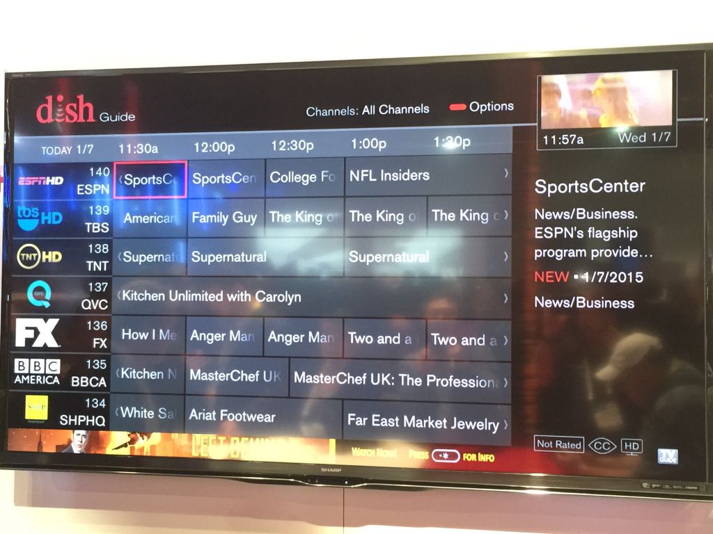
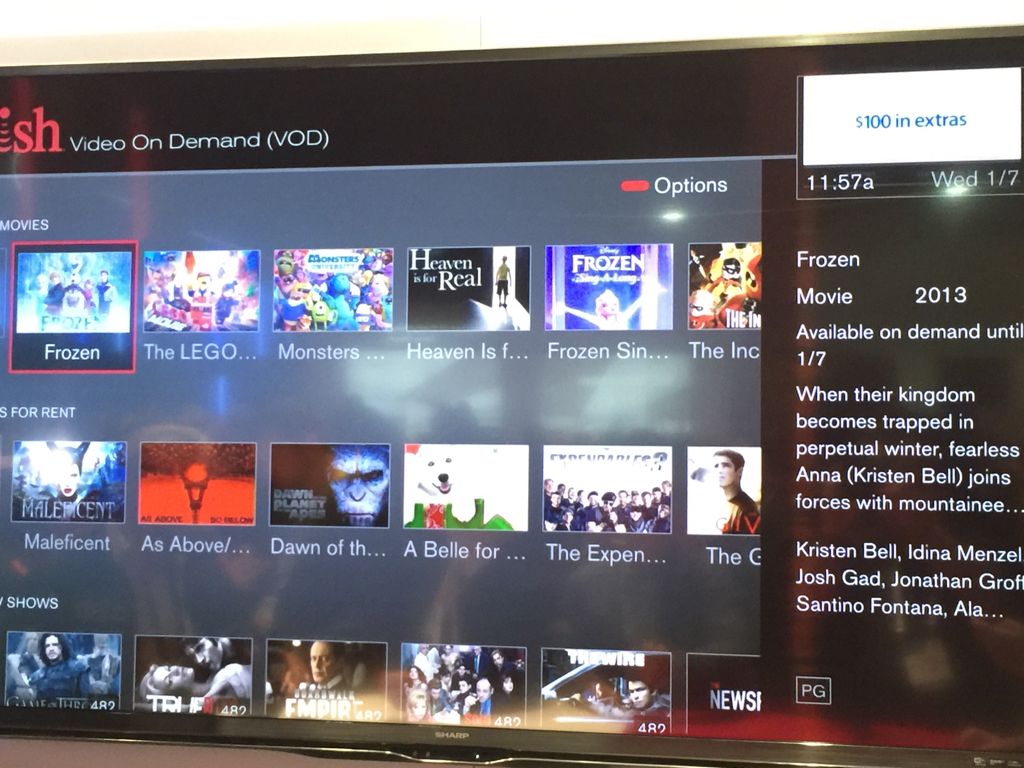
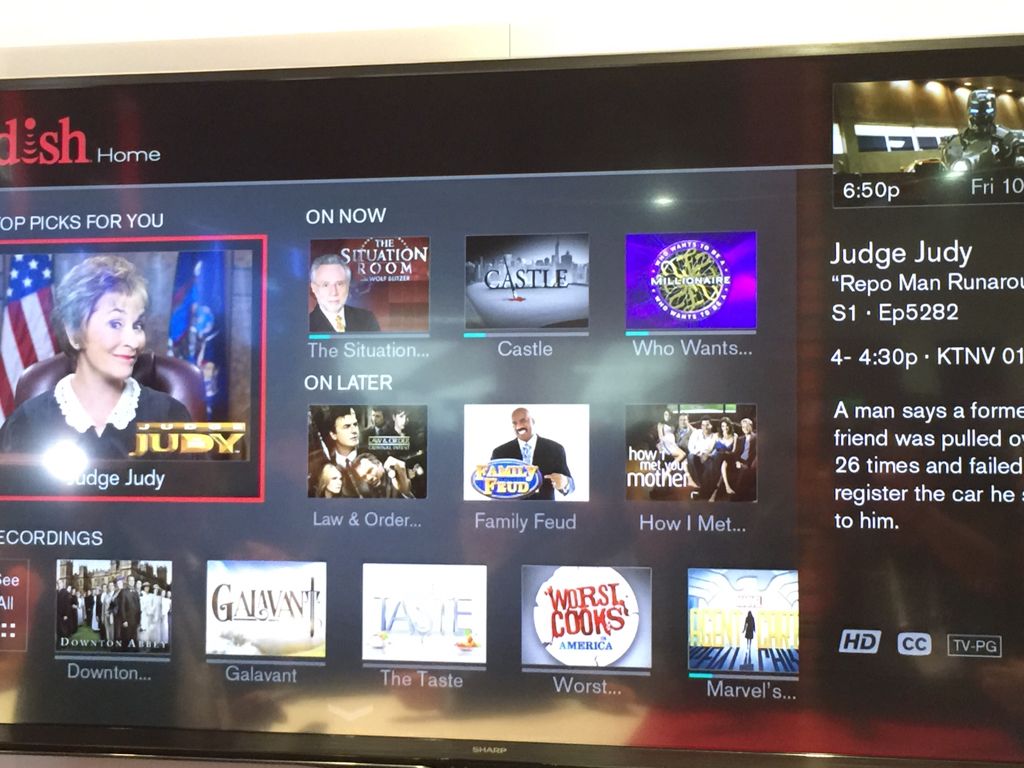
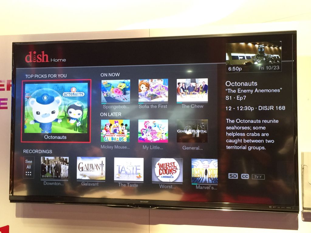
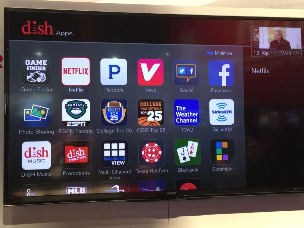
New DISH Hopper UI screen shots.

  • WELCOME TO THE NEW SERVER!

    If you are seeing this you are on our new server WELCOME HOME!

    While the new server is online Scott is still working on the backend including the cachine. But the site is usable while the work is being completes!

    Thank you for your patience and again WELCOME HOME!

    CLICK THE X IN THE TOP RIGHT CORNER OF THE BOX TO DISMISS THIS MESSAGE

Scott Greczkowski

Welcome HOME!
Original poster
Staff member
HERE TO HELP YOU!
Cutting Edge
Sep 7, 2003
102,579
25,908
Newington, CT
Hee are some screen shots of the new Hopper User Interface which will be coming this summer.
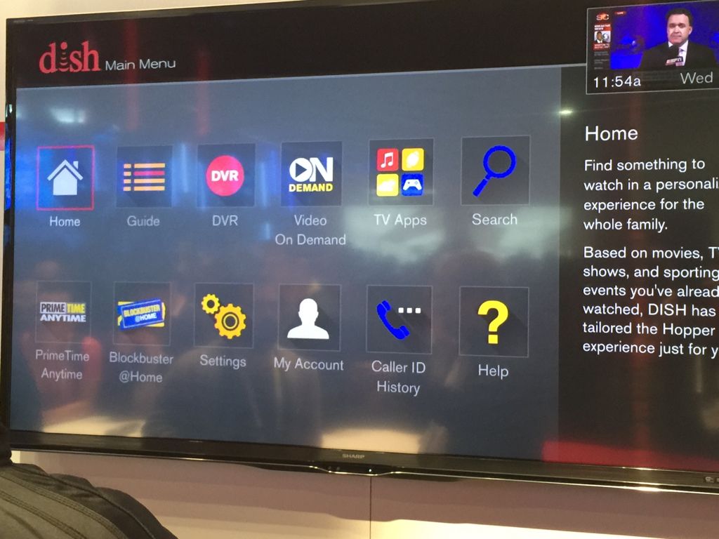
ImageUploadedBySatelliteGuys1420658132.013824.jpg
ImageUploadedBySatelliteGuys1420658155.049912.jpg

ImageUploadedBySatelliteGuys1420658177.421766.jpg
ImageUploadedBySatelliteGuys1420658199.124397.jpg
ImageUploadedBySatelliteGuys1420658257.546621.jpg
ImageUploadedBySatelliteGuys1420658360.305350.jpg


Posted Via The FREE SatelliteGuys Reader App!
 
I like the guide. I don't really like the menu screen or the My Recordings screen.

Agree. One thing that I never will understand is Dish's sometimes inconsistent approach to the interface or the fact they don't make their interfaces more user friendly by allowing customization (to a certain degree, obviously). For example, in the images above I still see their d@$% "icon Hell" approach to listing recordings (unless that red Options button they show onscreen will allow for what I've been asking of them for years now with the Hopper). A list view option in My Folders and not just a list in the all recordings option (do not want to sort through all the other family's recordings).

And for the search, it seems they no longer show icons, but changed to a list?!? See what I mean? They have the coding and capability for allowing both views so PLEASE implement more customization by us users so we can see a list of our recordings in any part of our DVR recordings screens!!
 
  • Like
Reactions: Jim S.
Am I seeing it right that the "Main Menu" icons look like Apple iOS' new "flat" look while the "Apps" menu are different ?
 
One thing I do not like is that you lose a half hour of guide for the info on the right. I have always liked the fact I could position my guide at 7 pm and see the entire nights prime time.
 
  • Like
Reactions: Go Sox!! and Jim S.
I hate flat design. Loathe it. Despise it. But, I kinda like the new Hopper/Joey UI. It very easy to read and discern functionality.

OTOH, the missing half hour on the guide is dumb and unnecessary. Just make the channel and info panes a little narrower, and you get the half hour back.
Got that Dish?

Also, having some customizations, like being able to select tile or list view makes a lot of sense.
 
  • Like
Reactions: foghorn2
I noticed the 1/2 hour missing also . Perhaps Dish will correct that by the time it's ready for a spring release. I like the new guide colors.
 

Users Who Are Viewing This Thread (Total: 0, Members: 0, Guests: 0)

Who Read This Thread (Total Members: 1)