The Look of the Home Page

Status
Not open for further replies.

Frank Jr.

Beati pacifici 5:9
Original poster
Supporting Founder
Apr 8, 2004
13,557
1,878
Columbia S.C.
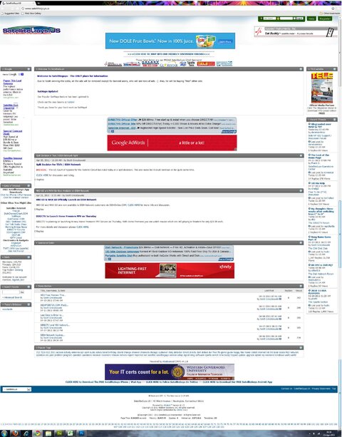
As a member I rarely look at the home page as a non registered member. I am concerned that the home page gets lost in the advertisements. I am not complaining about the ads but if I was someone looking for advise or information in reference to home satellite tv I would wonder what I just clicked on, a billboard or a site that I could discuss satellite tv. Again I am not complaining about the advertising as I know they help pay the bills around here, but if I didn't know better I would wonder what I just clicked on. The ads overwhelm the home page. The site logo in my opinion may better serve the site at the top center, after all the ads have a home here because of SatelliteGuys.US, not the other way around..
 

Attachments

  • Untitled.png
    Untitled.png
    159.5 KB · Views: 206
Last edited:
And yet the site needs to make a bit of money to stay open....... The largest portion of that screenshot is Welcome To Satellite Guys. I don't see an issue at all.
 
And yet the site needs to make a bit of money to stay open....... The largest portion of that screenshot is Welcome To Satellite Guys. I don't see an issue at all.
Bob I agree the ads are there for a reason. As I said I am not against the ads, but look at the home page not as a member but someone new to satellite tv..
 
I agree to some extent. As compared to some other AV sites, the ads are more prevalent. But the site seems to do well with the amount of subscribers so I guess it is working out. My personal complaint while related to ads, is not the placement of them. When I am at work, this site loads slower than any other site I go to. If I then sign in, it gets much better, but if I forget and click on a front page link, it hangs and hangs before loading. I have to assume it has something to do with the ads, or at least one of them?
 
my personal opinion is, if I go to a site for the first time looking for any info and come across an ad that size I usually avoid and don't return. :(
You said it better than I did in the original post. Top billing should be SatelliteGuys, it's purpose and goals........
 
I have the utmost respect for Scott, his staff and the website that he (Scott) created. I am honored and proud to be a member associated with SatelliteGuys.
However if one takes a hard look at the homepage as an unknowing person considering satellite tv, or someone having issues or questions with their system and visit the home page as a non member for the first time...........Log out, type in satellite tv on your browser, click on SatelliteGuys.US and take a hard look at what you first notice/see, or don't see.
 
Last edited:
Oh by the way turn off your ad blockers before looking at the homepage. I have used them in the past but felt so damn guilty when I would visit here.......
 
It's a tough balance, but I agree, the ads can overwhelm. It would be a deterrent to me, if I wasn't a pub member.
 
I loaded the welcome page minus the ad-blocker and it does look cluttered. But maybe they could organised better. I need to find the vB board I was on the other day that had as many ads, but they had them arranged such a way that it didn't over power the welcome page. The ads are needed though to help feed the server.

I usually jump right into one of the forums and bypass the welcome page.
 
The ads are placed under the recommendations from the ad agencies.

But remember you can customize the homepage to your liking and move stuff around. :)
 
The ads are placed under the recommendations from the ad agencies.

But remember you can customize the homepage to your liking and move stuff around. :)

The home page for members is fine. Yesterday I did a lot of house cleaning on my main computer. I removed a lot of old programs I don't use anymore and cleaned out my browser and some add ons. I then went to log back on and took a long look at the home page before logging back in, which I normally don't do. I was disappointed in the way it looked. I am not saying that we should remove any of the ads, but think the placement of them may hinder visitors from easily navigating the web site. In addition we have two places that we can log on. I like the green one in the upper right hand corner because it has the help and register options for visitors. The one on the left could be removed. If I had the software to manipulate items in a screen shot of the home page that visitors see I would try but I don't. If nothing can be changed/moved maybe the " Click Here To Enter Our Friendly Forums" could be bigger. As a member the home page looks fine. I am talking about what a visitor sees.;)
 
If I had the software to manipulate items in a screen shot of the home page that visitors see I would try but I don't. If nothing can be changed/moved maybe the " Click Here To Enter Our Friendly Forums" could be bigger. As a member the home page looks fine. I am talking about what a visitor sees.;)

I could take a screenie and play with it in PS. One thing though, unless a regular html page, the template has to be tweaked to put them in the exact desired spots.
 
Here's a mock I tossed together... Just for the fun of it. Kept all ads, just moved some and nuked the 2nd log in box.
 

Attachments

  • SGNew.jpg
    SGNew.jpg
    441.4 KB · Views: 205
Status
Not open for further replies.

Users Who Are Viewing This Thread (Total: 0, Members: 0, Guests: 0)

Who Read This Thread (Total Members: 1)