
<Wrong Hopper w/Sling version number is in forum thread. Meant to type S329 and not S239.>
I have to say I was really looking forward to the new S328 update, but it was more than a little let down. Was hoping DISH would have added a few things to enhance / fix the Hopper experience, but they missed the mark again. I truly don't think they do any sort of user acceptance testing and design things from their paying customer's perspective. I realize that no one can please everyone all the time, but if you look at my feedback objectively you'll see the improvements really do benefit all their customers by making a more "designed around you", simplified product.
If the Hopper just came out a few months ago I can see giving them a pass. But as a customer spending my hard earned money on their service and equipment (like all of us here) I have to be tough on them. Hopefully they will take more than one step back and look at their product from a different perspective (meaning the customer experience)...and help to reduce the number of times we have to press a darn button on the remote!
HDMI CEC
Great option. This was a hit. Took me a bit to figure out the DISH power button turns on Hopper and TV but that the TV power button turns both off I thought they missed the mark with a convenient one button press on/off solution. Plus.
Jump 10/30
While not any improvement I can see how they may have wanted to improve the on screen display (OSD) so people new to the Hopper understand that you skip ahead more then you rewind. And I think they wanted to make the OSD look a little more like the FWD and BACK button OSD with numbers. Sorta Plus.

Missing Icons
Noticed that the save and protect icons are no longer on screen by the tiles. Some customers may like to see what they saved from the PTA screen so they know that it's saved and not to worry (or forget they saved it and try to save it again). Protect icon shows on details screen still, but another step backward. No quality check for this before release?? Big minuses.


On Demand
Another step backward. In the old interface you had your options to refine your results as quick one click buttons. Great thinking. And now? The new interface has only one option showing. You then have to go into a filters screen to select more options. Too much button pushing. I get the fact they are trying to make a cleaner interface, but the design could be better.
Icons. OK, the new interface looks less crowded than the prior one. But too much going up/down and the dreaded left/right now. To lessen the pain of left/right you can use the Skip Back and Skip Fwd button on the remote to move a few at a time. And they could have made the See All icon at the beginning match the one at the end of a row. Inconsistent design.
They removed the search button as well. You can't push the Search button while in On Demand and get the main search with on demand already set as the filter. They also lost the ability to see all the details from the main screen like the prior version. No need to click the Info button or select the icon like you do now. Big minuses.


My Folders
Still have not fixed the My Folders "phantom folder" problem since Spring. And they have not added a way to edit them either. Can't delete or change the name. So a user can make a folder but not rename or delete if empty and no longer wanted. Poor user experience. Big minus.


My Folders, Part Duex
DISH still has not understood the concept of reducing screen content whenever possible for a clean user experience. For the life of me I cannot understand why they do not have the exact same list option (not icons) in My Folders that they do in Folders by Title. I've seen people post that say "just stay in the folders by title option and that solves your problem." No it does not. My Folders are still "folders", right? Why should I have to sift through ALL of the show icons in the folders by title option when all I want after a hard day at work is to see MY shows in one nice list and no more icons.
Took away the % watched as well. Yes, you can click another button to get to the details screen to see the % watched, but unnecessary. Big minuses.


Search
Another miss. Search has the nasty scroll left/right nonsense like On Demand. The search with number keys is OK as well as hiding the keyboard on screen, but still not a good experience. Still can't delete search history. What if you don't want your kids seeing what you might have searched for or accidentally (!!) type in "t-i-t" when you meant "i-t"? Explain that to the wife. You have to do a bunch or fake searches just to push it off the list. DISH also must isolate their departments or programmers so they never share ideas. Why? If you look back at the On Demand screen captures you see that they at least have an icon at the beginning telling the user there are more items. So they can click it immediately. The search programmers must not have seen the On Demand programmers because the darn 'See All' icon is ONLY at the end of the row you have to muddle through. And give us back the option to show results as a list like the pre-Hopper DVR's as opposed to this avalanche of icons all the time. I just shake my head... Big minuses.


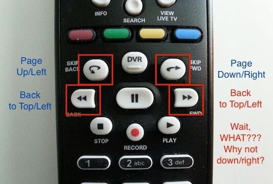
Remote Jump
On the remote you can use the page up and down buttons to move up or down a few lines at a time, but you can also use the skip back/fwd and back/fwd buttons to move the screen. Well, kind of. Again, did anyone at DISH test this? You can use the skip back button to move a page up (a few lines) or to the left. Skip fwd button moves a page down or right. Back button goes to the top of the page or all the way back to the left. So the Fwd button moves all the way to the bottom of the page or to the right, correct? No, it acts like the back button and goes to the top of the page. I just shake my head... OK, so you would think that since they added the ability to type letters using the number keys in the search function you could just press Z to go to the bottom or a letter of a show name to go to it, but no, didn't think to do that. No testing done again. Big minus.

Hoping they give us an early holiday present with update S329 for the Hopper with Sling and corresponding features for the regular Hopper and pay more attention to the user experience than trying to wiz-bang us with all these fancy do-dad updates. Unlike "we need more cowbell" in a song, we do NOT need more icons and button presses on our Hoppers!
I have to say I was really looking forward to the new S328 update, but it was more than a little let down. Was hoping DISH would have added a few things to enhance / fix the Hopper experience, but they missed the mark again. I truly don't think they do any sort of user acceptance testing and design things from their paying customer's perspective. I realize that no one can please everyone all the time, but if you look at my feedback objectively you'll see the improvements really do benefit all their customers by making a more "designed around you", simplified product.
If the Hopper just came out a few months ago I can see giving them a pass. But as a customer spending my hard earned money on their service and equipment (like all of us here) I have to be tough on them. Hopefully they will take more than one step back and look at their product from a different perspective (meaning the customer experience)...and help to reduce the number of times we have to press a darn button on the remote!
HDMI CEC
Great option. This was a hit. Took me a bit to figure out the DISH power button turns on Hopper and TV but that the TV power button turns both off I thought they missed the mark with a convenient one button press on/off solution. Plus.
Jump 10/30
While not any improvement I can see how they may have wanted to improve the on screen display (OSD) so people new to the Hopper understand that you skip ahead more then you rewind. And I think they wanted to make the OSD look a little more like the FWD and BACK button OSD with numbers. Sorta Plus.
Missing Icons
Noticed that the save and protect icons are no longer on screen by the tiles. Some customers may like to see what they saved from the PTA screen so they know that it's saved and not to worry (or forget they saved it and try to save it again). Protect icon shows on details screen still, but another step backward. No quality check for this before release?? Big minuses.
On Demand
Another step backward. In the old interface you had your options to refine your results as quick one click buttons. Great thinking. And now? The new interface has only one option showing. You then have to go into a filters screen to select more options. Too much button pushing. I get the fact they are trying to make a cleaner interface, but the design could be better.
Icons. OK, the new interface looks less crowded than the prior one. But too much going up/down and the dreaded left/right now. To lessen the pain of left/right you can use the Skip Back and Skip Fwd button on the remote to move a few at a time. And they could have made the See All icon at the beginning match the one at the end of a row. Inconsistent design.
They removed the search button as well. You can't push the Search button while in On Demand and get the main search with on demand already set as the filter. They also lost the ability to see all the details from the main screen like the prior version. No need to click the Info button or select the icon like you do now. Big minuses.
My Folders
Still have not fixed the My Folders "phantom folder" problem since Spring. And they have not added a way to edit them either. Can't delete or change the name. So a user can make a folder but not rename or delete if empty and no longer wanted. Poor user experience. Big minus.
My Folders, Part Duex
DISH still has not understood the concept of reducing screen content whenever possible for a clean user experience. For the life of me I cannot understand why they do not have the exact same list option (not icons) in My Folders that they do in Folders by Title. I've seen people post that say "just stay in the folders by title option and that solves your problem." No it does not. My Folders are still "folders", right? Why should I have to sift through ALL of the show icons in the folders by title option when all I want after a hard day at work is to see MY shows in one nice list and no more icons.
Took away the % watched as well. Yes, you can click another button to get to the details screen to see the % watched, but unnecessary. Big minuses.
Search
Another miss. Search has the nasty scroll left/right nonsense like On Demand. The search with number keys is OK as well as hiding the keyboard on screen, but still not a good experience. Still can't delete search history. What if you don't want your kids seeing what you might have searched for or accidentally (!!) type in "t-i-t" when you meant "i-t"? Explain that to the wife. You have to do a bunch or fake searches just to push it off the list. DISH also must isolate their departments or programmers so they never share ideas. Why? If you look back at the On Demand screen captures you see that they at least have an icon at the beginning telling the user there are more items. So they can click it immediately. The search programmers must not have seen the On Demand programmers because the darn 'See All' icon is ONLY at the end of the row you have to muddle through. And give us back the option to show results as a list like the pre-Hopper DVR's as opposed to this avalanche of icons all the time. I just shake my head... Big minuses.
Remote Jump
On the remote you can use the page up and down buttons to move up or down a few lines at a time, but you can also use the skip back/fwd and back/fwd buttons to move the screen. Well, kind of. Again, did anyone at DISH test this? You can use the skip back button to move a page up (a few lines) or to the left. Skip fwd button moves a page down or right. Back button goes to the top of the page or all the way back to the left. So the Fwd button moves all the way to the bottom of the page or to the right, correct? No, it acts like the back button and goes to the top of the page. I just shake my head... OK, so you would think that since they added the ability to type letters using the number keys in the search function you could just press Z to go to the bottom or a letter of a show name to go to it, but no, didn't think to do that. No testing done again. Big minus.
Hoping they give us an early holiday present with update S329 for the Hopper with Sling and corresponding features for the regular Hopper and pay more attention to the user experience than trying to wiz-bang us with all these fancy do-dad updates. Unlike "we need more cowbell" in a song, we do NOT need more icons and button presses on our Hoppers!
Attachments
Last edited:
") All of your issues are most likely the same as others as well. Your concerns will be, (probably have been) viewed by the folks at DISH. Thanks, and again, well done!!
All of your issues are most likely the same as others as well. Your concerns will be, (probably have been) viewed by the folks at DISH. Thanks, and again, well done!!")

