That happened to me as well, but when I received 1036 that solved it for me.Waited 48 hrs after doing a CLEARMYBOX and still never got the logos back on 1001. I just went back to the old software by forcing it. See if the channel logos come back. Going to try and get 1006 or 1036 tomorrow morning if it shows up.

New Guide UI now rolling out (plus HDR support!)
- Thread starter Scott Greczkowski
- Start date
- Latest activity Latest activity:
- Replies 2K
- Views 226K
You are using an out of date browser. It may not display this or other websites correctly.
You should upgrade or use an alternative browser.
You should upgrade or use an alternative browser.
- Status
- Please reply by conversation.

Here's a recent great video I found on how to update step by step, but it's simple to do. I upgraded to 1036 with no issues and was coming from 1003.
If you missed it this morning I am guessing it will be daily till Friday unless something supersedes it. So far I have not had any issues and coming from 1001 (NR) about a week ago it's been the answer for many of my issues. Well 1003 did that for me but it's no longer in the stream as it appears 1036 has replaced it.
I only got to mess around with 1036 for a little bit. It seemed much faster and the font looks 10x better. Still could be bolder I think, but better than 1001. Channel logos are still there for me. Happy I was able to get this. Will test it out later today after work.
P.S. The channel logos are hugeeeeee
P.S. The channel logos are hugeeeeee
I also downloaded 1036 to my HR44 this morning and noticed that in the menus I can get out of "what's on now" faster and start down to "settings". There had been considerable lag before.
Confirmed.
I only got to mess around with 1036 for a little bit. It seemed much faster and the font looks 10x better. Still could be bolder I think, but better than 1001. Channel logos are still there for me. Happy I was able to get this. Will test it out later today after work.
P.S. The channel logos are hugeeeeee
Here is a screen shot so everyone can see it
") .
.PLEASE LOG IN TO GET RID OF THESE ADS!
Attachments
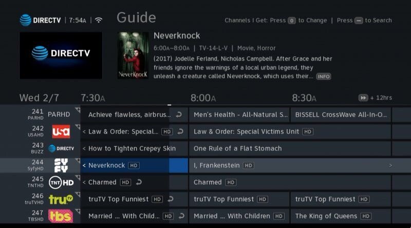
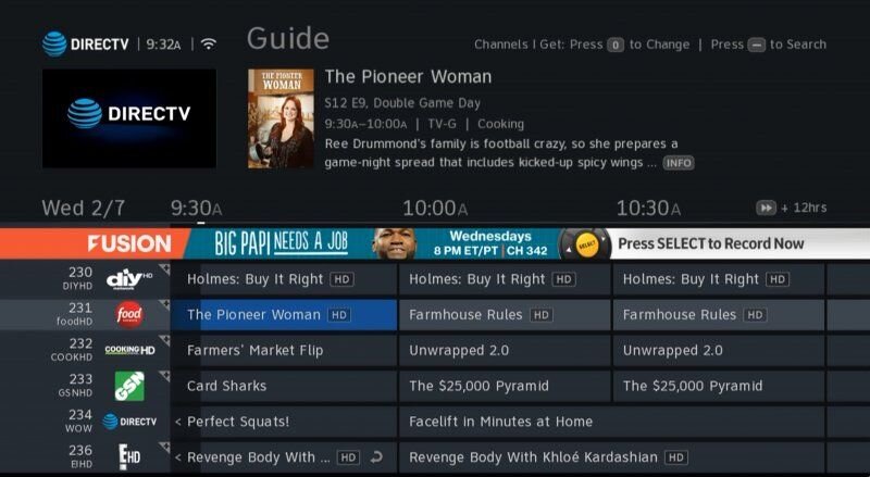
I'm sure everyone will appreciate that. I would say the logos are probably too big, but much better than 1001. On 1001, they looked so choppy and pixelated. With them bigger, they look like they are in a much better resolution. I think the font could increase just a bit more. I think some may find it hard still to read from far away, but it is great to see what AT&T has done with improvements since 1001.Here is a screen shot so everyone can see it

They really need to move that +12Hrs to the top of the screen and replace it with an extra half hour.
I personally love how the logos look in the guide, and the guide and overall text is much improved IMO over previous versions. Like said above though, i think they still need to make the overall text a little bolder to make it easier to see especially further away from the screen. Which is an issue i have at times with my eyes. The old version text was big and very easy for me, and the contrast was just right. But i can see the newest pretty good, so im happy they are constantly making improvements.
Tried to edit my previous post but couldn't figure it out, but like when looking at the playlist, and the menu on the side, is like darker shade, same with the guide, if they would make all the text a bright white, like the old UI, or at least give the option, be really nice and much easier to see
Agreed, make the font white and everyone would be able to see it better, simple stuff but maybe it's not that simple in the way the code is written. Currently there are zero options but I bet that's by design with the idea of a uniform look. From what I understand changes to our platform (DTV) are no longer a silo, saying that uniformity across all the AT&T product lines are the future. So a change here has to be across all platforms that use the same guide layout etc. I might be wrong but that is what I am hearing....Tried to edit my previous post but couldn't figure it out, but like when looking at the playlist, and the menu on the side, is like darker shade, same with the guide, if they would make all the text a bright white, like the old UI, or at least give the option, be really nice and much easier to see
PLEASE LOG IN TO GET RID OF THESE ADS!
Another thing i would change is the bar that comes up when you pause, rewind, or fast forward, takes up a lot of the screen, and blocks everything behind it, should be made smaller, doesnt need to be that huge.
Sounds like 0X1036 is a rollout, thus not CE as many others are getting it too.I got 1036 pushed to my 54-700 this morning at 2:30 am
Sounds like 0X1036 is a rollout, thus not CE as many others are getting it too.
It's a national release?? Thought it was CE only
It got pushed to my HS17 on Tuesday night and I'm not part of CE anymore.It's a national release?? Thought it was CE only
PLEASE LOG IN TO GET RID OF THESE ADS!
It got pushed to my HS17 on Tuesday night and I'm not part of CE anymore.
Wow. Can't wait to get it. This is one with larger icons for channel logos right? Is it smoother and faster?
But even when holding the buttons down, its not bad at all IMO
i love it
PLEASE LOG IN TO GET RID OF THESE ADS!
- Status
- Please reply by conversation.
Similar threads
- Replies
- 3
- Views
- 1K
- Replies
- 1
- Views
- 175
- Replies
- 81
- Views
- 6K
- Replies
- 48
- Views
- 2K
- Replies
- 11
- Views
- 3K