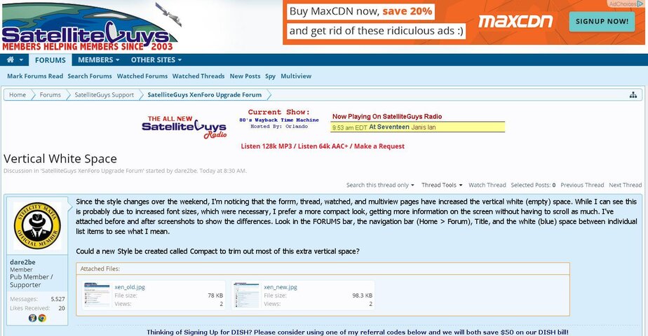
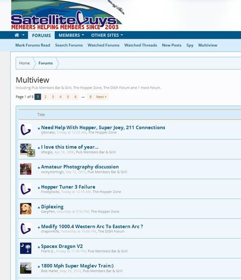
Since the style changes over the weekend, I'm noticing that the forrm, thread, watched, and multiview pages have increased the vertical white (empty) space. While I can see this is probably due to increased font sizes, which were necessary, I prefer a more compact look, getting more information on the screen without having to scroll as much. I've attached before and after screenshots to show the differences. Look in the FORUMS bar, the navigation bar (Home > Forum), Title, and the white (blue) space between individual list items to see what I mean.
Could a new Style be created called Compact to trim out most of this extra vertical space?
Could a new Style be created called Compact to trim out most of this extra vertical space?

")