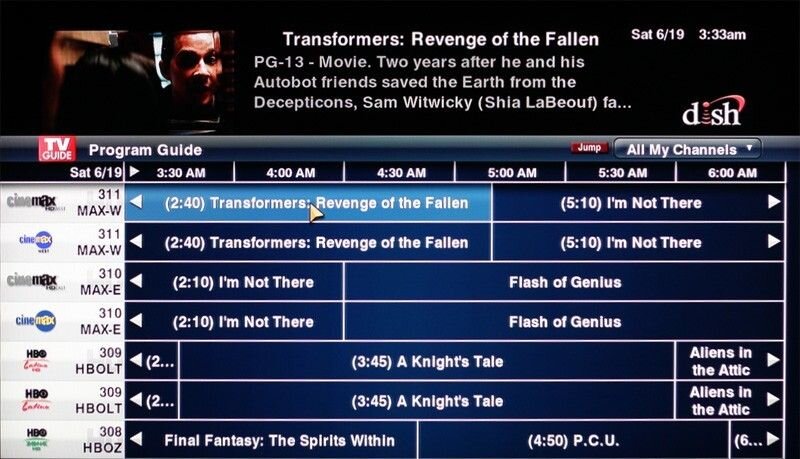
New dish customer Hate the User Interface

Now THAT would be cruel!!!

Why? My 922 is the best receiver I've ever had. It's been flawless since day one. It's fast, sleek and looks great in my entertainment center. And yes, the sling works great also! The UI is beautiful too. My brother has the 722 and the last time I was over there I couldn't believe how old and outdated that UI looks. Embarrassing even. Even my Charter Moxi DVR from 6 or 7 years ago was light years ahead of the 722 UI. Actually, The Moxi was pretty good all around. Just a little slow.
 
You may want to consider consulting a lawyer and seeing what your options are. If Dish told you that you were getting one thing and didn't deliver on it, that sounds like that should be a legal "out" to get out of your contract. The problem is, the bill from the lawyer would probably be as bad as the cancellation fee or worse, with no guarantees that they can get you out of anything.

Contracts for services like this really aggravate me as a consumer. It's a really bad trend that rarely works to our advantage. Companies change the services around, raise prices, and so on and so forth, and if our financial circumstances force us to need to get out, we can't. It seems like a trap all the way around. I only signed on the dotted line (figuratively speaking) because I really I needed that first year's promotional rate to make the finances of pay television work for me.
 
Actually, The Moxi was pretty good all around. Just a little slow.

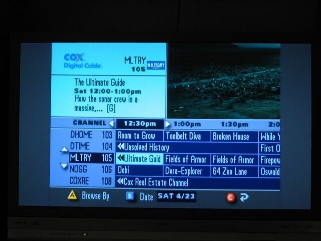
Well there you go. I'd rather a fast 722K over a slow "pretty" Moxi any day of the week. Check out Charter's Moto guide interface, talk about archaic:

guide.jpg

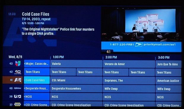
Now we look at Moxi:

moxi-grid-guide.jpg

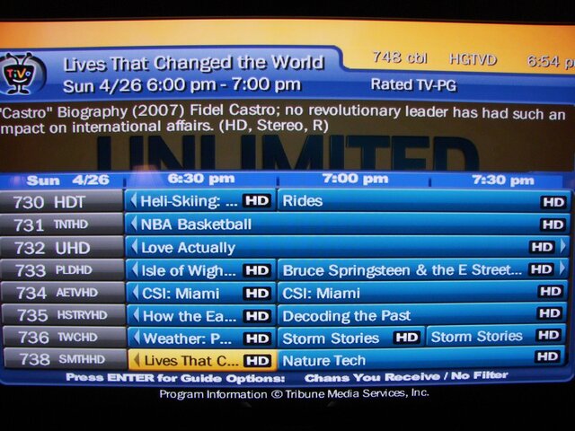
Ehh, it's alright, nothing to write home about. Now TiVo:

100_1017.jpg

Again, nothing special.

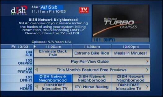
722K:

722k_EPG_screen_2-WEB.jpg

Nothing special, but no worse than the last 2, and FAR better than the Moto guide.

922:

dish_vip922_prog_guide.jpg

Looks great, but 922 isn't worth it anymore, should wait for Hopper/Joey.
 
A couple features I loved about Moxi: It had more than an hour of buffer time. (I don't remember exactly how long). Also, If you were watching a show, say you were an hour in and you had to leave, so you decide to record it. Push the record button and it would record the whole show from the beginning without rewinding it first.
 
Contact one of the Dish Internet Response Team members here. As far as the UI it isn't the best but much better than all but the TV guide one above. the TIVO one was not one I would like but your being used to it is why you like it. To go to the Hopper Joey combo you will most likely have to pay an upgrade fee. The only way around that would be again a DIRT members.
 
Well there you go. I'd rather a fast 722K over a slow "pretty" Moxi any day of the week. Check out Charter's Moto guide interface, talk about archaic:

View attachment 73591

Now we look at Moxi:

View attachment 73592

Ehh, it's alright, nothing to write home about. Now TiVo:

View attachment 73593

Again, nothing special.

722K:

View attachment 73594

Nothing special, but no worse than the last 2, and FAR better than the Moto guide.

922:

View attachment 73595

Looks great, but 922 isn't worth it anymore, should wait for Hopper/Joey.

Actually, Moxi looks better than 722, Tivo and the Moto box. The 922 blows them all out of the water. Not even a contest. What's with the Moto guide? That thing looks like it's out of the eighties... Lmao!
 
I suppose that's a subjective thing about Moxi looking better than 722. Yeah sure it has logos, but personally I like the color theme of the 722 better and lets not forget the 722 can also do 7 channels at a time like the 922. I personally prefer 5.

Yeah the Motos are awful, a friend of mine has one, I was thinking "What kinda chip you got in there, a Dorito?" (Thanks, Weird Al, lol...)
 
The 922 UI is pretty, and uses trendy tiles to illustrate the options. Tiles are OK if you can directly touch a spot on the screen but we have a remote with arrow keys and a select button (the beta touchpad remote got a lot of negative comments).

Here are the steps to get to OTA setup (optional MT2 module required):
menu-right-right-right-select-down-down-down-right-right-select (11 keystrokes)
If you can remember the color-button shortcuts, that can be cut to
yellow-down-down-down-right-right-select (7 keystrokes)
On the "ugly" interface (IIRC): menu-6-8 (3 keystrokes)

Point Dish can be quicker on the 922, yellow-yellow (or worse at 11 keystrokes) vs menu-6-1-1.

I have a 922 and 622 (same UI as 722k) and prefer the efficiency of the numbered menus.

You apparently haven't seen timer setup yet, so I'll raise the blast shields and just say in advance there are advantages to being able to adjust options at creation.

Both have a 7-channel x 3-hour guide display. You can side-scroll a screen or day at a time using the FF or Skip buttons (oddly reversed on the 922), or by keying a number of hours up to 99 and pressing Rt-arrow.

I don't get the calls for research. Post #1 sentence 2 shows OP did just that but the rep provided information on the wrong receiver. Should he have been expected to seek out a user community and ask if Dish misled to him? That said, a search here would have turned up http://www.satelliteguys.us/dish-network-forum/166892-722k-screen-shots-initial-setup-thoughts.html.
 
I can't believe I am now reading people complain about how many times they have to press a button. UGH! I know pressing menu-6-1-1 was easy but customers doing it on their own usually didn't realize they can do it that way and still hit the up and down buttons to navigate through the menu. I have the 922 and never did I think it was a hassle to navigate through the menu. Maybe I'm not getting lazy enough yet, and I can get pretty darn lazy. ;)
 
Lack of homework, plain and simple.

Not necessarily.
In my case, when they offered me the 922 I have done my homework, and knew that the monthly fee was $10.
But they actually offered me the 922 so I thought it was an offer, and asked about the monthly fee specifically, and yet the person told me $6. I asked you sure it won't be $10? No, it will be $6.
So I got it.
And guess what? It is $10. And all they can do was say sorry for the false information that I was given.

:rant:
 
I am fairly surprised people are that upset with the 722/k interface. Make sure you set it to have 7 channels up and down and 3 hrs out. It looks better and is more functional. The new DTV guide is basically a copy of the 722 with more "glassy" looking graphics, who cares?
 
I'm in the opposite boat... we switched from Dish to Verizon to save money on internet and I HATE the guide. Dish's guide is basic, but it got the job done and was laid out in a way that was not completely terrible. I go to the fios boards and every day tons of people are complaining about how bad the guide is... and the worst part is that their guide was an upgrade! I can't imagine how bad the original one was.
 
Here are the steps to get to OTA setup (optional MT2 module required):
menu-right-right-right-select-down-down-down-right-right-select (11 keystrokes)
If you can remember the color-button shortcuts, that can be cut to
yellow-down-down-down-right-right-select (7 keystrokes)
On the "ugly" interface (IIRC): menu-6-8 (3 keystrokes)

yellow-0

2 keystrokes
 

Users Who Are Viewing This Thread (Total: 0, Members: 0, Guests: 0)

Who Read This Thread (Total Members: 2)