Logos in the new guide!

Status
Please reply by conversation.

coinmaster32

SatelliteGuys Pro
Original poster
Sep 25, 2010
916
14
USA
I downloaded the CE software with the new guide.

I love it except for two things.

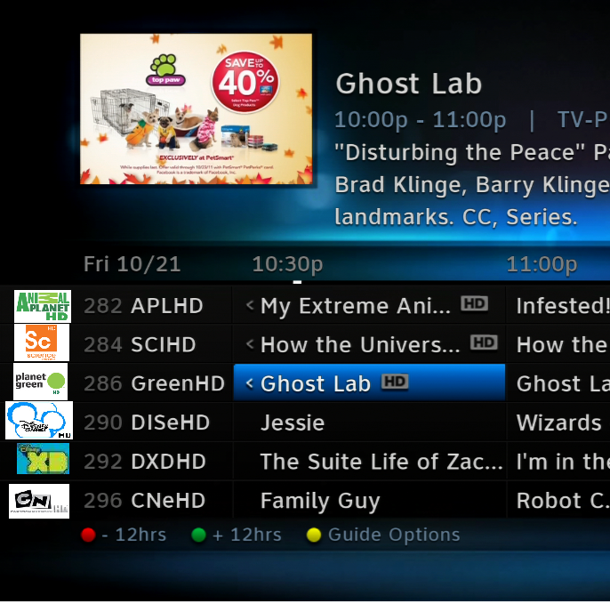
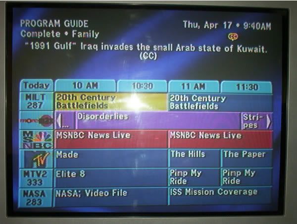
1. Top window banner should have some transparency to it.

2. They should have logos in the left like some of the older receivers did.
directvprogramguide3.jpg
 
Last edited:
Show logos show on the top right from whatever your on in the guide already.

I think he means channel logos on the guide grid display like cable and Dish have. I agree that it is a pretty glaring omission for premium DirecTV. Perhaps D will add this in later boxes that can handle such tech demands on the processor.
 
Logos add nothing to the actual programs. That EPG shown looks like 1980's cartoon crap. Thank God for the EPG we have now and nothing like that hideous EPG..
 
This is what I meant. There is a large blank area on the left, it would dress up the guide if there was logos on it, IMO.
guidelogo.png
 
I think he means channel logos on the guide grid display like cable and Dish have. I agree that it is a pretty glaring omission for premium DirecTV. Perhaps D will add this in later boxes that can handle such tech demands on the processor.

It's entirely possible that they could add on to the guide as we go, no one said this guide was a done deal ...
 
how do we down load a new guide.

YOU HAVE TO DOWNLOAD THE CE ON FRIDAY OR SATURDAY NIGHTS.HERES THE LINK BETWEEN THE HOURS OF Window of opportunity to download:
Friday, October 21, 2011 11:00PM - 2:30AM ET
Saturday, October 22, 2011 11:00PM - 2:30 AM ET

http://www.satelliteguys.us/directv...ion-forum/269708-hr2x-ce-release-10-21-a.html HERES MORE ON THE NEW GUIDE http://www.satelliteguys.us/directv-forum/269657-new-hd-gui-3.html

Then read the How To's so you know what your getting into.

http://www.satelliteguys.us/directv...2-directv-cutting-edge-program-terms-faq.html
 
I Don't know about anybody else but I much prefer to have a text label for identifying channels in the Guide.

John
Your saying the way it is now ?

Thats what Charper and I have been saying, don't want the colored logos on each channel, keep the text the way it is.
Show the show logo when you go to the Info pages.
 
I wouldn't mind having the graphic in addition to the text, with the caveat that I wouldn't want it to slow down the high speed scrolling that we now have...

--Steve
 
I wouldn't mind seeing the logo behind the channel number and text in each cell in the left column.

Of course it would be made very transparent and 'dimmed' so that the text takes precedence.

Maybe an option to show or hide logos in the guide. They can do options... they have the smooth scrolling option for example (which I don't know what that's supposed to even do in the new GUI- it always scrolls smooth).
 
An option would be preferable. The Hughes receivers had an option to hide the logos and make the guide thinner.
 
I was thinking more subdued logos. A lot more transparency maybe. This mock up I did looks better than yours with the big white plastered backgrounds and the logos were put on another layer at 25% transparency level.


Uploaded with ImageShack.us
 
Status
Please reply by conversation.
***

Users Who Are Viewing This Thread (Total: 1, Members: 0, Guests: 1)

Who Read This Thread (Total Members: 1)